A great resume can help get you noticed by prospective employers. But what makes a resume “great”? How do you catch recruiters’ attention, encourage them to read your resume, and ultimately call you for an interview?

Two words: Simple and effective.
In this piece, we’ll offer a step-by-step guide to writing a simple, effective resume. Then, we’ll showcase 20 examples of what this looks like in practice. Ready to level up your resume-writing technique? Let’s get started.
Table of Contents
How to Write a Simple Resume
While resume specifics vary depending on the type of job you’re looking for and the experience required, there are seven steps that apply in any circumstance to help your resume stand out.
1. Pick a format.
Before you start writing, pick a format that suits both your personal style and works for the position being offered.
For example, if you’re applying for a graphic design position, it may be worth including images on your resume that help highlight your skills.
If the job you’re after is a highly technical engineering role, meanwhile, you may want something more straightforward.
Regardless of the format you choose, the goal is simplicity. Don’t clutter the resume with extraneous information or conflicting colors. Instead, let your experience and interest speak for themselves.
2. Start with your contact information.
No surprise here — prospective employers need to know how they can contact you. Despite the necessity of this contact data, however, it’s not uncommon to see it missed on resumes or left until the bottom of the page.
Best bet? Put your details — including name, phone number, and email address — at the top of the page as a header.
3. Include an overview.
Next is an overview of your professional profile. This may include details about your current position along with any titles or degrees you hold.
Depending on the role, you may also want to include links to digital portfolios or work you’ve published online.
4. List your education and experience.
Education and experience are up next.
This should be a simple list of your educational history, including any degrees or certificates you’ve earned and when you earned them, followed by a list of your previous work experience.
Bullet points work well here: Each bullet point represents a different job and includes details such as job title, responsibilities, and how long you were employed.
5. Speak to your skills.
Now it’s time to talk about your skills as they relate to the job being offered.
Wherever possible, use keywords from the job advertisement itself. This is because many companies now use automated resume analysis and tracking systems that may prioritize these keywords.
6. Highlight any relevant certifications.
Make sure to mention any relevant qualifications or certifications.
For example, if you’re applying with an IT security firm, you could highlight certifications such as CompTIA Security+ or Certified Ethical Hacker (CEH) qualification.
7. Add any relevant details.
Finally, add any other details that are relevant to the job, such as volunteer experience in a related field or any professional accolades for your work.
20 Simple Resume Examples
Simple, effective resumes offer the best chance of getting noticed, but there’s no one-size-fits-all template when it comes to design.
Here are 20 simple resume examples.
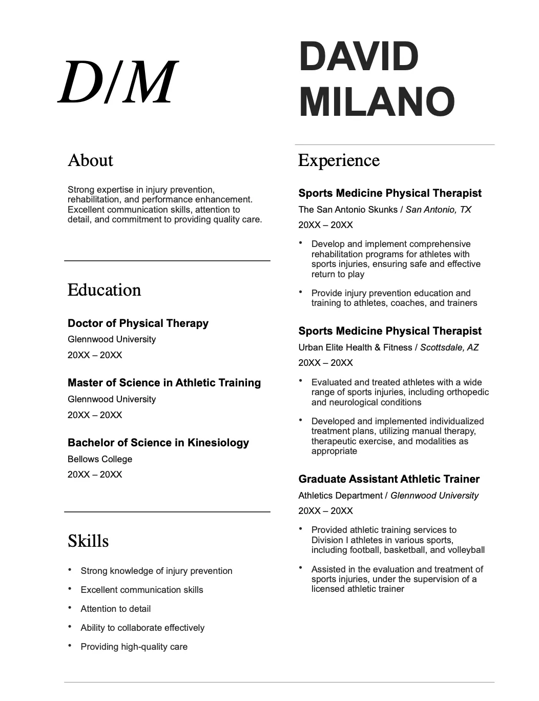
1. Modern Initials (Word)

The first four templates on our list are all from Microsoft Word.
To access these templates, open Word, select New from the left-hand sidebar, and then type “resume” into the search box that appears. Word will bring up a host of resume template options for you to download and use.
Modern is one of the first templates listed and offers a clean and simple format for all of your details. The minimalist design means that your information stands out.
What we like: Simplicity is the focus of this template. Every section is clearly marked, and there’s no hunting for data.
2. Bold Modern (Word)
This Word template is similar to the example above but with the addition of a sidebar for profile and contact information. It also comes with increased emphasis on your skill set.
What we like: Bold Modern puts you and your skills front and center, which is a great fit for jobs that prioritize real-world experience over specific certifications.
3. Crisp and Clean (Word)
Crisp and clean is a great description of this template. Unlike Bold Modern, there are no images — instead, one box of color is used to highlight your objective.
What we like: Using boxes, this template thinks a bit outside the box with a non-standard setup for information.
4. Creative (Word)
The Creative template from Word trends back toward the simple but brings your experience to the forefront.
It effectively divides your personal and professional lives into two columns, which can be a boon for recruiters looking for specific data.
What we like: It’s easy to find what you’re looking for in this template, making it a great choice for a simple, effective resume.
5. Spearmint (Google Docs)
The next five examples on our list come from Google Docs. To access these templates, head to Google Docs and then select Template Galley in the upper right-hand corner.
First on our list of Docs templates is Spearmint, presumably named for its green accent color. This template isn’t pushing any boundaries but offers a solid starting point for simple resumes.
What we like: Spearmint reads well. A quick scan of the resume gives HR teams exactly what they need: an overview of your skills, experience, and education.
6. Swiss (Google Docs)
The Swiss template from Google Docs offers a minimalist approach to resume data by separating headings from information.
What we like: Because the headings are separate, hiring teams don’t need to scan the entire document for what they want. Instead, they can simply find the heading they want and move straight across.
7. Modern Writer (Google Docs)
This template is a great fit if you’re applying for writing or publishing jobs. A cute touch is that the font used looks similar to that of a typewriter.
What we like: The unique font helps this example stand out from the crowd. Worth noting? Fonts are best used sparingly. Go too far into left field — say with Comic Sans — and your resume may not have the intended effect.
8. Coral (Google Docs)
Coral is similar to Modern Writer but with a more familiar font. There’s nothing flashy about this example, which is why it works: All relevant data is presented in an easy-to-see and easy-to-read format.
What we like: The “Hello, I’m…” detail at the top offers a slightly different take on the common resume introduction, which can help you get noticed.
9. Serif (Google Docs)
Serif splits up your data into two columns, with skills and awards on one side and education and experience on the other. It’s a simple way to highlight what you offer while keeping your resume easy to read.
What we like: Finding information on this resume is quick and easy, which is ideal considering the number of resumes teams often have to review.
10. Infographic (Venngage)
This Venngage template takes a wildly different approach to resumes by using an infographic format that relies on graphics rather than text. It’s a great way to quickly capture attention.
What we like: The rating bubbles for skills showcase not only ability but proficiency, which could help get you noticed.
11. Streamlined Infographic (Venngage)
Another infographic example from Venngage, this template splits the resume in two with graphics at the top and text at the bottom, plus a photo in the middle.
What we like: By using graphic skill depictions on the top half of the resume and explanatory text on the bottom, it’s easy to get a general sense of the applicant’s capabilities and skills.
12. Data Focused Infographic (Venngage)
This infographic is all about skills, education, and experience data.
By using a combination of skill and timelines paired with simple graphics, this resume manages to communicate a substantial amount of data without becoming too complex.
What we like: The three-block design used is a great way to break up resume text into manageable pieces.
13. Chronological (Resume Builder)
This example from Resume Builder focuses on chronological work experience. Then, it follows up with key skills and education.
What we like: Chronological resumes are a great way to show the progression of job responsibilities and promotions over time.
14. Functional (Resume Builder)
This example digs into professional experience with detailed descriptions of job responsibilities and roles. While the experience section remains chronological, the focus isn’t on time, so much as effort.
What we like: By highlighting the role and responsibilities of each previous job, this resume helps applicants build a case for why they should be considered.
15. Targeted (Resume Builder)
Our last Resume Builder example is designed to target a specific role. While all the familiar sections remain, each includes information that speaks to the applicant’s ability to excel if hired.
What we like: Creating a targeted resume can help get you noticed because it means you’ve taken the time to read and review exactly what the company is looking for in their new hire.
16. Cubic (Zety)
Cubic opts for a three-toned greyscale approach that separates each section. This makes it easy for recruiters to zero in on what matters rather than having to search your resume for specific data.
What we like: The bold background used for the header puts your name and contact information front and center.
17. Primo (Zety)
Primo uses a right-hand sidebar with star ratings to show off your skills, coupled with a timeline of work experience in the main body.
What we like: This resume changes up the standard format just enough to be interesting, but not so much that recruiters are left frustrated trying to find relevant information.
18. Cascade (Zety)
Cascade goes in the opposite direction to Primo with a left-hand sidebar and a right-side section that contains more detailed information.
What we like: The bold, left-hand sidebar is great for short descriptions of skills that are relevant to your new potential role.
19. Concept (Zety)
Concept is a great choice if you have education and skills but lack more in-depth work experience. The solid-colored sidebar works well as a timeline background, which helps give the resume a sense of momentum.
What we like: Even without a lot of work experience, you could still be a great fit for a new role. This template helps showcase the complete picture of your skills and abilities.
20. Crisp (Zety)
Crisp offers simplicity in black-and-white. Rounded icons and rating scales save this template from being all text, but don’t detract from your achievements and experience.
What we like: This is a great example of simple and effective without being boring. All the relevant data is here, but it’s not just a wall of text.
The Simple Resume: Basic But Not Boring
Simple, effective resumes help you get noticed by making it easier for HR teams and recruiters to find the information they need and make a decision.
But simple doesn’t mean boring. While there’s no need to reinvent the wheel when it comes to building your resume, the templates listed above can help your resume stand out for all the right reasons.
![→ Download Now: 12 Resume Templates [Free Download]](https://no-cache.hubspot.com/cta/default/53/4ec95757-585e-40cf-9189-6b3885074e98.png)

![27 of the Best Professional Bio Examples I've Ever Seen [+ Templates]](https://blog.hubspot.com/hubfs/Untitled design (63).jpg)


![27 of the Best Professional Bio Examples We've Ever Seen [+ Templates]](https://blog.hubspot.com/hubfs/professional-bio-examples-4.webp)


